
Figure 2.
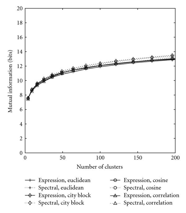
Performance of K-means clustering. The solid curves represent the clusterings based on original gene expressions while the dotted curves stand for clusterings based on spectral densities.
Official websites use .gov
A
.gov website belongs to an official
government organization in the United States.
Secure .gov websites use HTTPS
A lock (
) or https:// means you've safely
connected to the .gov website. Share sensitive
information only on official, secure websites.
Performance of K-means clustering. The solid curves represent the clusterings based on original gene expressions while the dotted curves stand for clusterings based on spectral densities.