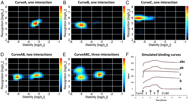
Figure 4. Heterogeneity and kinetic properties of simulated binding curves, presented as Interaction Maps.
Interaction Maps were calculated from simulated binding measurements to illustrate the ability to decipher complex interactions. The Interaction Maps display every contributing interaction of the measured binding curve as a peak with specific recognition (log(ka)) and stability (log(kd)) coordinates using colors representing the relative degree of contribution (red: large contribution, blue: small contribution). Panels A, B, and C contains maps for monovalent interactions (CurveA, CurveB, CurveC). Panel D shows a map for the complex interaction CurveAB known to contain two independent interactions (CurveA+CurveB). Panel E shows a map for the complex interaction CurveABC known to contain three independent interactions (CurveA+CurveB+CurveC). The corresponding simulated binding curves are shown in Panel F. The binder was added first at 3 nM, then at 9 nM, followed by dissociation during several hours, as indicated by the arrows.

