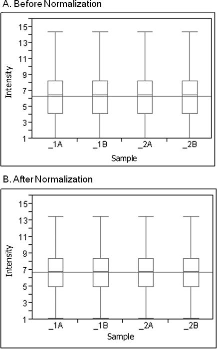
Figure 1.

Robust multiarray analysis of pre and post normalized expression of whole blood. The box and whisker plot of each fresh sample (marked as 1A and 2A) and frozen sample (marked as 1B and 2B) illustrates the distribution of log 2 intensity values for transcript expression levels before (A) and after (B) normalization. The top and bottom of the box represent the 25th and 75th percentile, respectively. The band within each box is the median and the band line extending through all boxes is the grand mean of all arrays. The ends of the whiskers represent the 10th and the 90th percentile.
