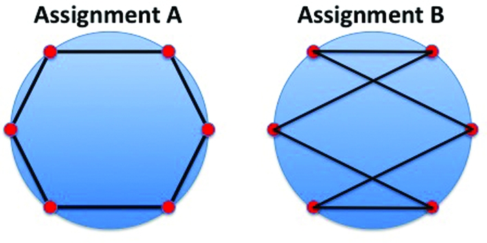
Figure 2.

The two different neighborhood assignments indicated by the black lines have the same likelihood. Assignment A, which ‘connects’ neighbors, is clearly preferred to assignment B. An additional ‘contiguity constraint’ is required to distinguish between these two assignments. The circle perimeters represent the ‘true’ data manifold, the red dots represent the model images  and the black lines represent the neighborhood assignments.
