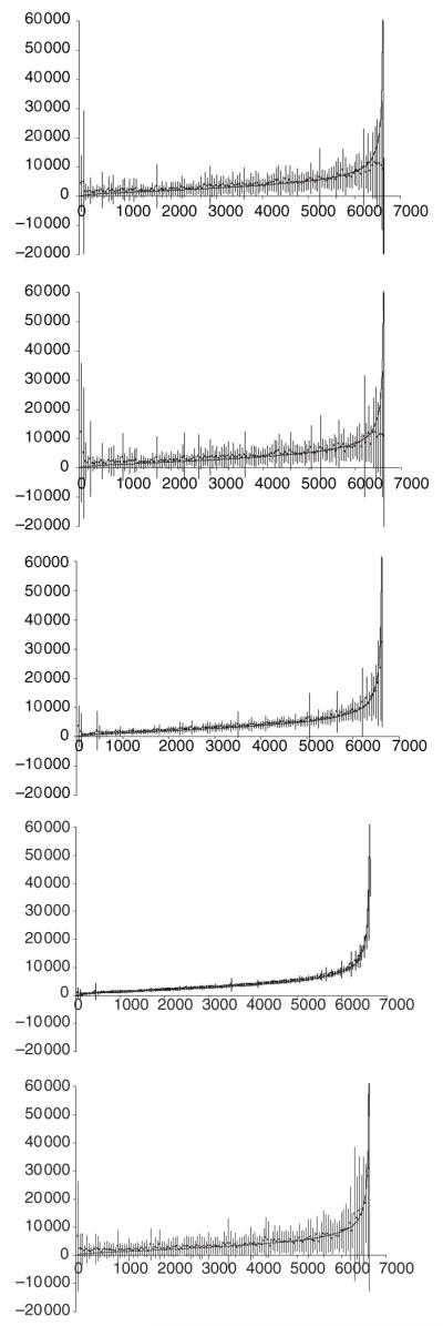
Figure 5.

Accuracy of raster population maps for Kenya by sub-location. From top left to bottom right: UNEP99, GPW299, GPW399, GPW3UR99 and LS99. The graphs show population number (y-axis) by sub-location ordered from lowest to highest population (x-axis). The thick black line are the census counts (CBS 2001). The dots and error bars are the mean and root mean square error, respectively, averaged for sequential blocks of 50 sub-locations for clarity.
