
Figure 1.
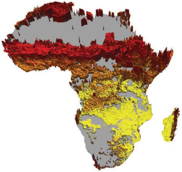
Environmental distance from the INDEPTH DSS network in Africa. Yellow represents the lowest through red the highest values with a vertical exaggeration applied to emphasise the differences. Areas with population densities of <1 person per km2 have been masked in grey.