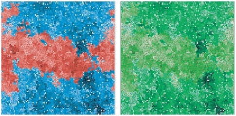
Figure 4. Landscape of fitness values in the middle of a typical one run.
These pictures correspond to a moment when the average fitness of the non aging species was 0.89 and that of the aging species, 1.17. Left Panel The division between the species is clearly shown, with red representing the non-aging species and blue, the aging species. Both for blue and red, lighter tones indicate a smaller fitness, while darker tones correspond to a higher fitness. Right Panel Same circumstances as in the left panel, but only fitness is shown in tones of green, with no distinction between the species, so that their fitness can be better compared.

