
Figure. Distribution of Cohort Person-years and Hemorrhage Events by Risk Categories.
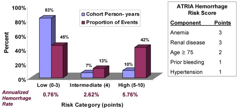
Blue bars show the proportion of cohort person-years in low, intermediate, and high bleeding risk categories. Purple bars show the proportion of the total hemorrhage events (n=461) captured by each risk category.