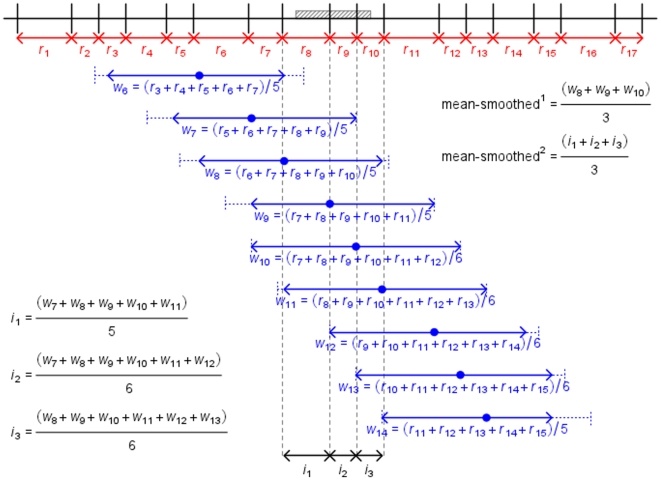
Figure 2. Methodologies used to generate smoothed recombination rates.
Representation of methods used to calculate smoothed recombination rates (method 4.2.4). Note that this diagram is for descriptive purposes only and is not to scale. For simplicity, only calculations for mean rates are shown. The grey region is a gene. Vertical black lines are SNP markers. In red are recombination rates between pairs of neighbouring markers (rx). Dashed blue lines represent 1 Mb windows either side of a focal SNP. Solid blue arrows represent all intervals within this window, over which recombination rates are averaged (wx, averaged-smoothed1). For three intervals, averages of all window averages covering the interval are shown (ix, average-smoothed2).

