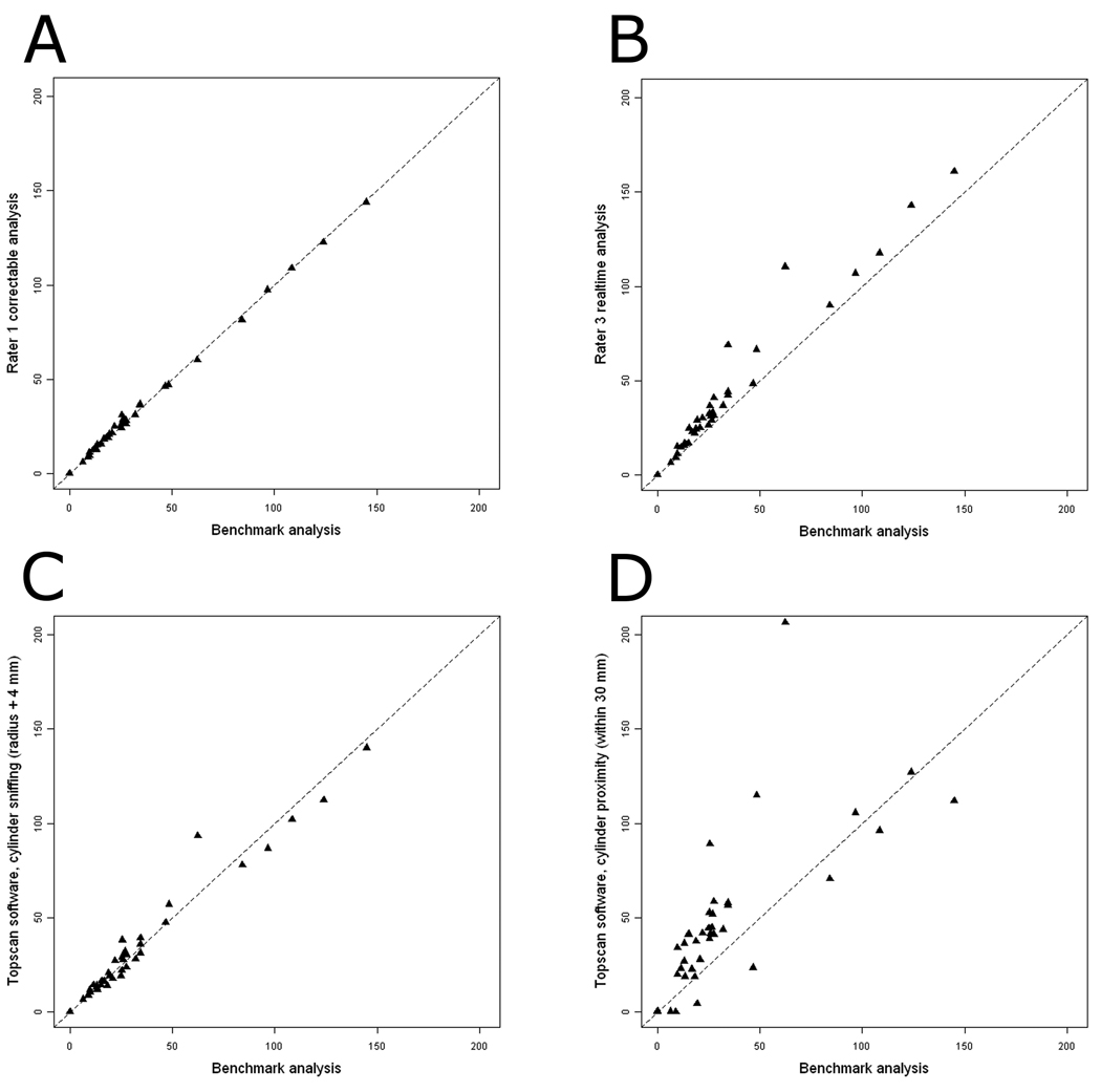
Fig. 5.
Scatterplots of manual and automated methods of measuring social and nonsocial cylinder time with the benchmark analysis. N = 40. The dotted line indicates y = x, which represents perfect agreement between the two analyses. (A) Rater 1 correctable analysis (the manual analysis with the highest correlation to the benchmark analysis) vs. the benchmark analysis. (B) Rater 3 realtime analysis (the manual analysis with the lowest correlation to the benchmark analysis) vs. the benchmark analysis. (C) TopScan software, cylinder sniffing with the radius of the cylinder extended by 4 mm vs. the benchmark analysis. (D) TopScan software, cylinder proximity within 30 mm vs. the benchmark analysis of social cylinder time.

