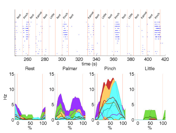
Figure 5.
Raster plots and spike rates. Top panel: raster plots for different classes of spikes during the selection of each type of movements by the subject. Bottom panel: corresponding spike rates for the corresponding classes windows (mean = larger lines; mean ± SD = smaller lines and colourful areas; areas are colored when not overlapped). Window duration for each class has been normalized (from 0 to 100%). The red vertical lines delimit the timing of the classes triggering in both top and bottom panels. Only windows with the fixed width of the controlled experiment have been used.

