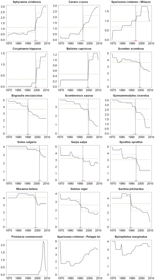
Figure 4. Dynamic of the abundance of ‘SIMPER species’, according to fisher's perceptions.
Trends of relative abundance on a scale from 0 to 5 (see text) of the species contributing mostly to the SIMPER analysis. Bold continuous line: mean relative abundance; dashed green line: null model of no temporal change in relative abundance; dashed blue lines: best fitting local regressions before and after break point; vertical dashed line: breakpoint or year of significant change in the temporal evolution of abundance, with 95% confidence intervals in red brackets.

