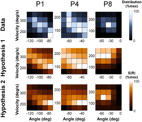
Figure 5. Two-dimensional histograms of two representative individuals' data and the corresponding hypothesized distributions for Experiment 1.
The left panel shows the trial frequency, the middle panel shows the expected result E(R) of Hypothesis 1, the right panel shows the predicted distribution of Hypothesis 2. As the units of the three distributions are different they were all normalized to the range between 0 and 1. Note that the black color codes the lowest value and should not be mistaken for the high-penalty regions in Figure 3.

