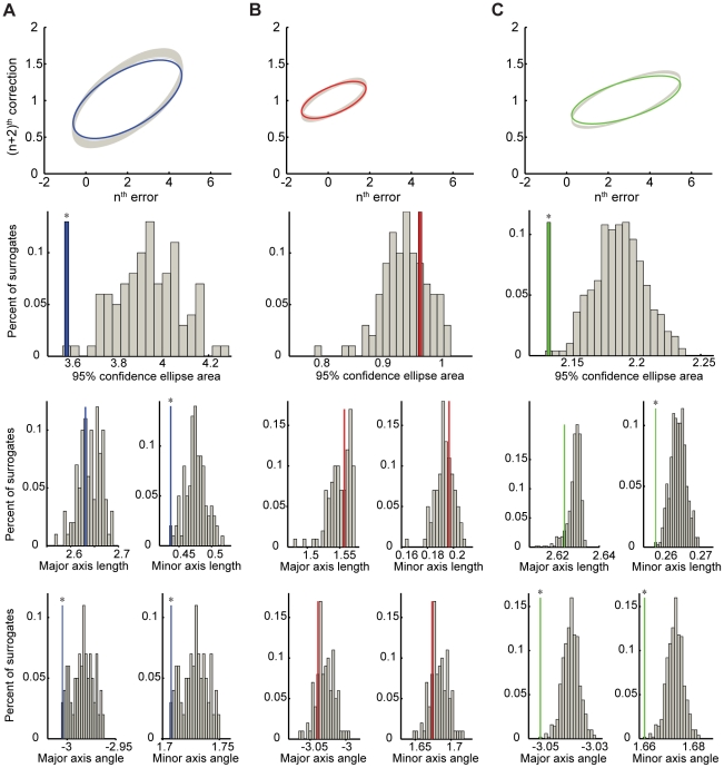
Figure 3. Surrogate data analysis of trial-by-trial error corrections.
Data show one representative time series from predictive-saccade tracking during Task 1 (A, blue), reactive-saccade tracking in the corresponding control task (B, red), and simulation data from an ARFIMA(0,d,0) process (C, green). In all cases, the top panel shows the CE95 for the actual data (thick colored line) and the generated set of surrogates (multiple overlapping gray ellipses). The lower three panels show comparisons between the data and surrogates across the five characteristic CE95 parameters (from top to bottom): the ellipse area, major and minor axis lengths, and major and minor axis angles. The gray bars on the histogram plots are the data from the surrogate time series; the single colored bar on each histogram is the actual time series data, which has been rescaled vertically for clarity. Significant differences at greater than the p = 0.05 level are indicated by (*).

