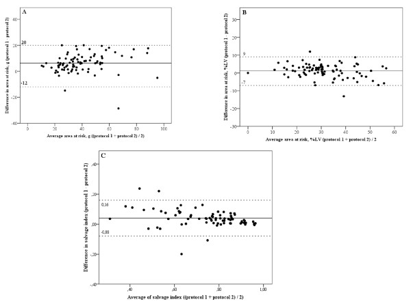
Figure 1.
Bland Altman plot of the mean difference between the two different protocols. This figures shows the mean difference between protocol 1 (TE 65msec; slice thickness 15 mm) and protocol 2 (TE 100 msec; slice thickness 8 mm) in area at risk expressed as % of the left ventricle (LV) (A) and in absolute mass (g) (B) and in salvage index (C). The marked line represents the mean difference and the dotted lines represent upper and lower limits of agreement. LV, left ventricle.

