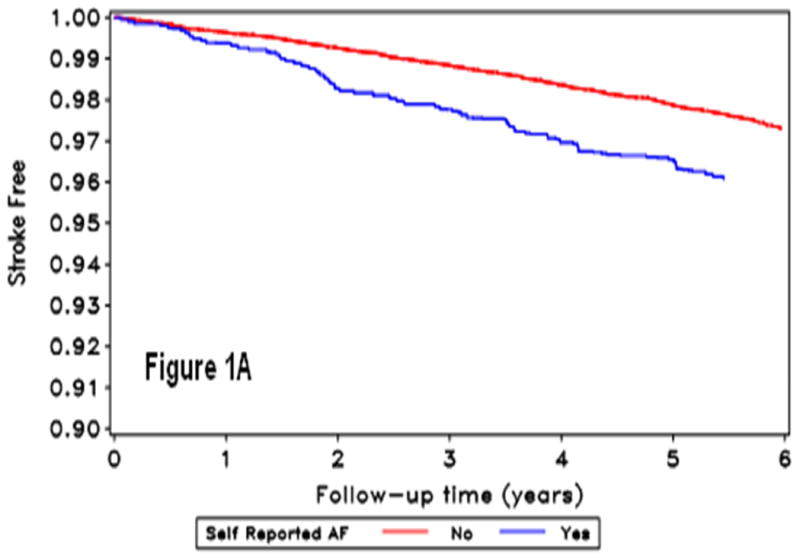
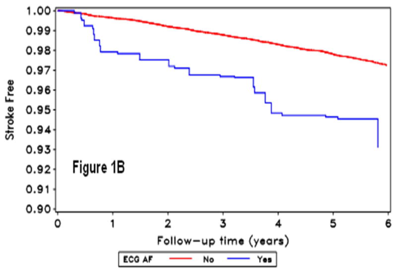
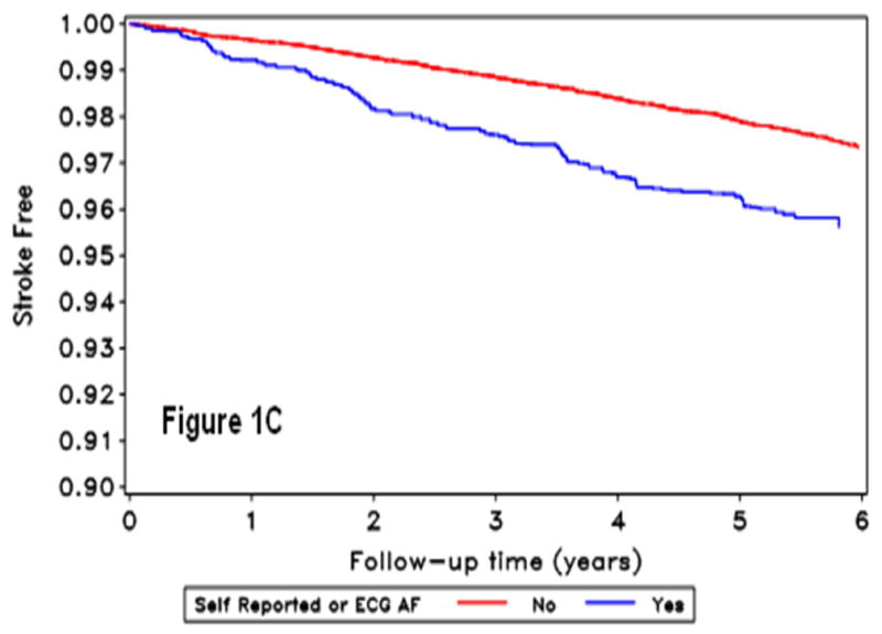
Figure 1.


Kaplan Meir curves for incident stroke by self-reported-AF (A), ECG detected-AF (B), and AF by either self-report or ECG (C). The horizontal axis shows follow-up time in years, and the vertical axis the proportion of the population stroke-free for those without (red line) and with (blue line) atrial fibrillation condition.
