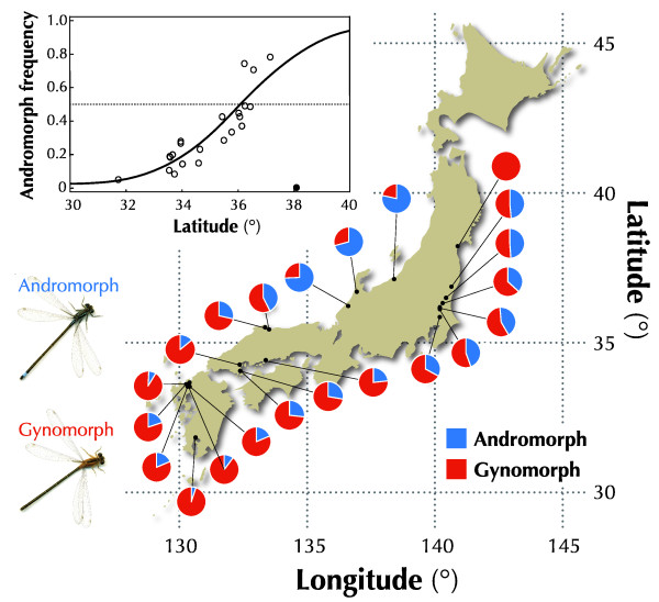
Figure 1.
Latitudinal cline in morph frequency. Morph frequencies for each local population were shown as a pie chart (blue: andromorph; red: gynomorph). The frequency of andromorphs increased with latitude. The inset Figure shows the logistic regression with the latitude (t = 8.15, df = 21, P < 0.001), excluding the northernmost population (solid plot).

