
Accessory Figure 1. Predicted motif genome location distribution.
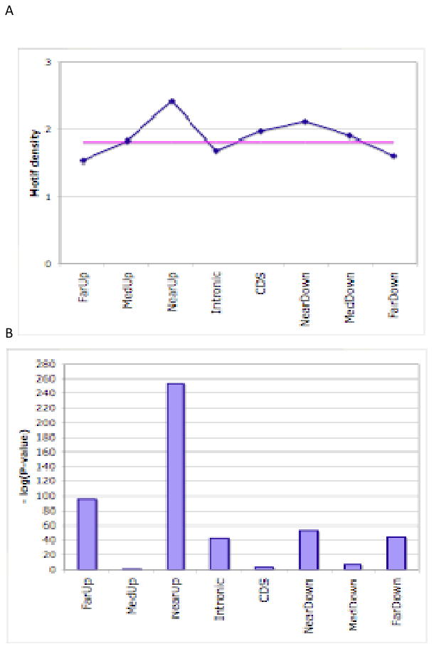
(A) Density of predicted motifs (y axis) for different categories of regions (x axis) in terms of location with respect to their nearest genes, shown in blue. The horizontal pink line is the genome-wide average. See text for definitions of motif density and various region categories. (B) P-values of enrichment or depletion of motif occurrence in each category of regions, using one-tailed Fishers exact tests. Negative logarithms are shown.