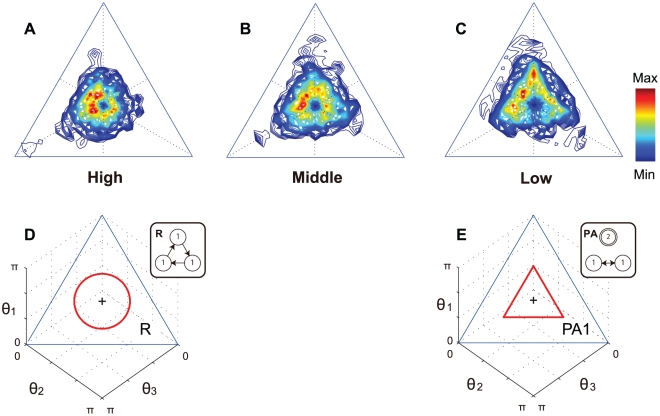
Figure 4. Comparison between the experimental data and predicted patterns.
(A-C) Color contour plots show experimental time-frequency trajectory plots on the phase plane. (A), (B), and (C) show the high-, mid-, and low-level groups, respectively. The color indicates the height normalized by the maximum and minimum frequency values for each skill level. Dark red is the highest and dark blue is the lowest, while white represents no trajectories. (D, E) Two predicted trajectories on the phase plane selected from Figure 2. (D) shows a rotation pattern (R) that is similar to (A) for the distribution of the high-level group. (E) shows a partial anti-phase pattern ( ) that is similar to (B) and (C) for the mid and low levels, respectively.

