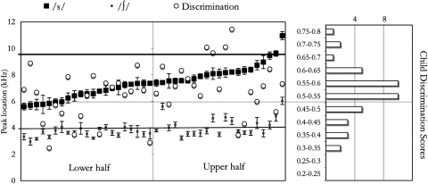
Figure 4.
Individual data are plotted on the left panel, sorted by ∕s∕ peak location. For each dyad, peak location in the caregiver’s speech is noted with squares (∕s∕ = dark; ∕∫∕ = light; both plotted on the kilohertz scale shown on the far left; error bars indicate standard errors); and the infant’s discrimination score is plotted with a white circle in the same vertical line (using the scale between the two panels). The right panel shows a histogram for infants’ discrimination score (on the same scale). The dotted horizontal line crossing both panels signals the 0.5 proportion level for the discrimination scores, above which there would be an evidence of successful discrimination. The other two horizontal lines, crossing only the left panel, represent the average peak location for the ∕s,∫∕ stimuli used in the infant test (∕s∕ = dark, ∕∫∕ = light).

