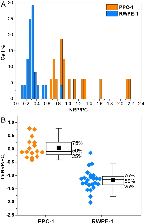
Fig. 5.
Statistics of the SERRS ratios obtained from cancer and normal cell populations. (A) The histogram represents the percentage of either RWPE-1 (blue) or PPC-1 (orange) cells that have the values of the NRP/PC ratio indicated. (B) Box plots of the NRP/PC ratio for both PPC-1 and RWPE-1 populations after application of the logarithmic transformation to render both distributions normal. The experimental data (orange dots for PPC-1 cells and blue dots for RWPE-1 cells) are depicted on the left of each box as a visual aid. The middle line of each box represents the median, the solid black square is the mean, and the whiskers define the inner upper and lower fences beyond which possible outliers are found. The boxes do not overlap, indicating statistically excellent differentiation between these two populations; t test n1 = 16 and n2 = 24, p < 0.001.

