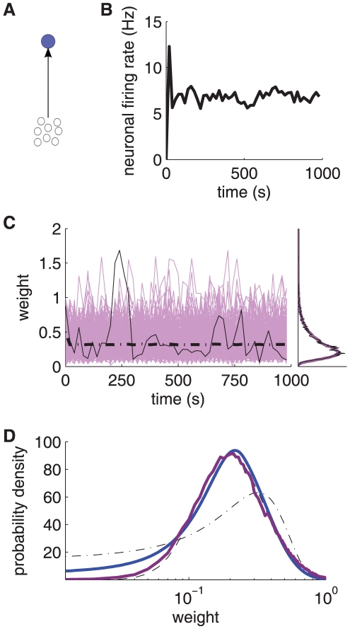
Figure 4. Strong shuffling of individual weights within the stable distribution.
A: Schematic diagram of the neuron (top blue filled circle) stimulated by a pool of 3000 uncorrelated inputs (bottom open circles). B: Evolution of the neuronal output firing rate. C: Evolution of synaptic weights in the case of uncorrelated inputs. The purple traces represent a portion of the input weights recorded every 20 s, the black thin trace corresponds to an individual weight, and the black thick dashed-dotted trace indicates the mean weight over the  inputs. Right inset: The mean weight histogram averaged over the learning epoch is plotted in purple and the spot histogram at time 1000 s is represented by the black thin line. D: Comparison between the simulated weight distribution (purple thick curve; it corresponds to the purple curve in C) and the analytical prediction (blue thick curve; same as Fig. 3) with a log scale for the weights (x-axis). The black thin curves represent a Gaussian fit (dashed-dotted) and a lognormal fit (dashed) of the simulated weight distribution, obtained using linear regression. The same baseline parameters as in Fig. 3 have been used here.

