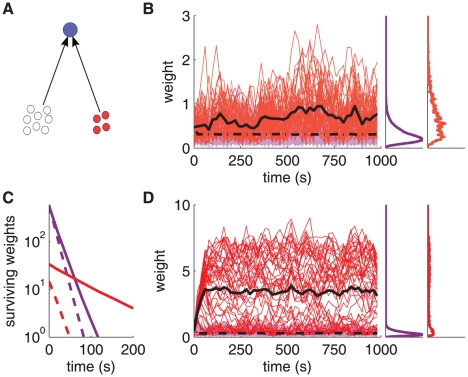
Figure 5. Input spike-time correlations lead to robust weight specialization.
A: Schematic diagram of the neuron (top blue filled circle) stimulated by a pool of 2950 uncorrelated inputs (bottom open circles) and a pool of 50 correlated inputs (bottom red filled circles). B: Evolution of the synaptic weights for the configuration in A with weak correlation ( ). The correlated group is favored (red traces, mean in black thick solid line), synonymous with a greater chance of appear in the tail of the distribution compared to uncorrelated inputs (purple traces, mean in black thick dashed-dotted line). Right insets: normalized time-averaged histograms. C: Survival time of the weights from uncorrelated (purple curves) and correlated (red curves) inputs in the top 20% of the distribution. Comparison between log-STDP (solid curves) and mlt-STDP (dashed curves). The y-axis indicates the number of synapses present in the top 20% at each counting round (performed every 20 s) from 100 s until the time on the x-axis. The data are averages over 20 trials. D: Similar to B with stronger correlation (
 ). The weights from correlated inputs are pushed out of the main body of the distribution and saturate to a much larger value than the mean (black thick dashed-dotted line), roughly 30 times larger here.

