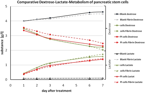
Figure 9.
Graph of the comparative dextrose–lactate metabolism of pancreatic stem cells. Dextrose curves for all samples are indicated by a dot at each measurement and lactate curves are indicated by a triangle at each measurement. Dashed lines are used for fibrin samples and solid lines for non-coated samples. Gray and black lines represent the blanks. Green lines are used for samples on cell culture plastic and red lines for samples on polyimide films. Sample names are depicted in the legend.

