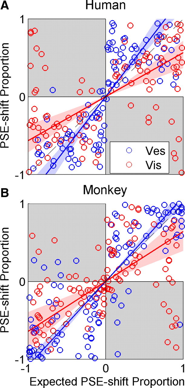
Figure 6.

Actual versus expected proportional PSE shift. Actual versus expected proportional PSE shifts are plotted for the human (A) and monkey (B) data. Blue and red lines represent type II regressions of the vestibular and visual data (blue and red circles), respectively. The regression lines were constrained to pass through the origin. Blue and red shaded regions represent 95% confidence bands of the regressions. If PSE shifts were to follow the RBA predictions, the regression for both cues would lie on the line y = x (dashed black line). Gray shading represents regions where adaptation was in the unexpected direction. Vis, Visual; Ves, vestibular.
