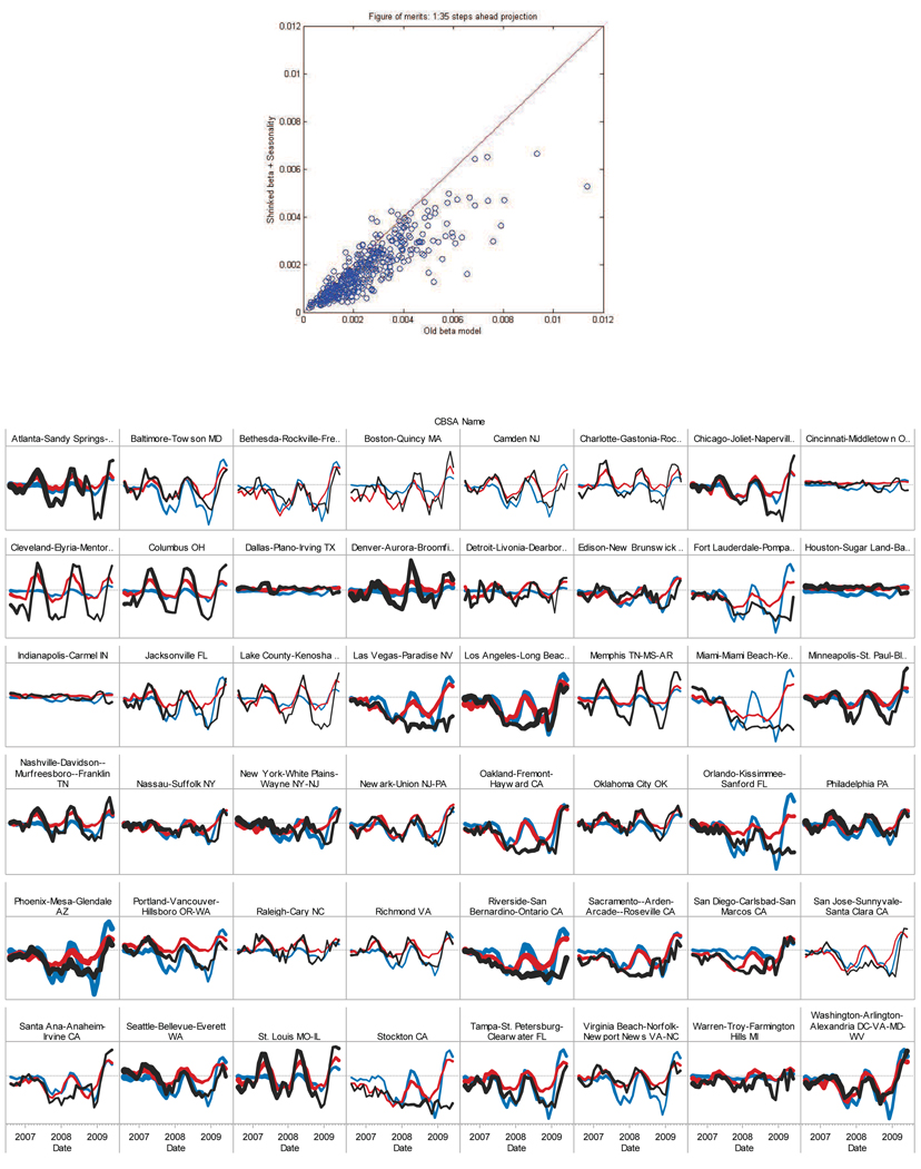
Figure 2.
Top: Forecast error comparison over 352 counties. For each dot, the x-axis represents error by OLS with only national factor, y-axis error by PLS with additional neighborhood information. If the dot lies below the 45 degree line, PLS outperforms OLS. Bottom: Forecast comparison for the largest counties during test period. Blue: OLS. Red: PLS. Black: Acutal. Thickness: Proportion to repeated sales.

