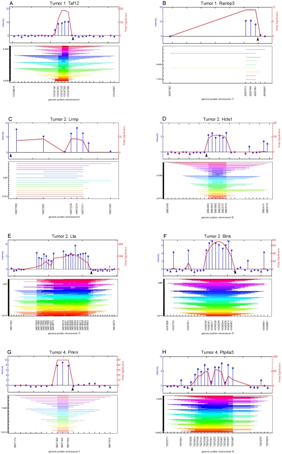
Figure 3. Identified viral integration sites.
Eight viral integrations identified with HAT could be confirmed with directed PCR and Sanger sequencing (see Table S1 for further details). The graphical output of HAT is represented in graph A–H. Above each graph, the tumor in which the integration was identified as well as the nearby located gene are indicated. The upper panel of each graph shows normalized intensities of the different probes (blue lollipops) on the mouse promoter 1.0R arrays and their significance (in red) as calculated with HAT. The black arrowhead indicates the exact position of the proviral integration, as determined by directed PCR followed by Sanger sequencing. In the lower panel the lowest and highest probe intensity threshold with a significant outcome are given on the left. The stripes indicate significantly enriched regions at different probe intensity thresholds, calculated with HAT, which are merged into the final viral integration site. Below each graph, the genomic position is indicated (assembly mm8, February 2006).

