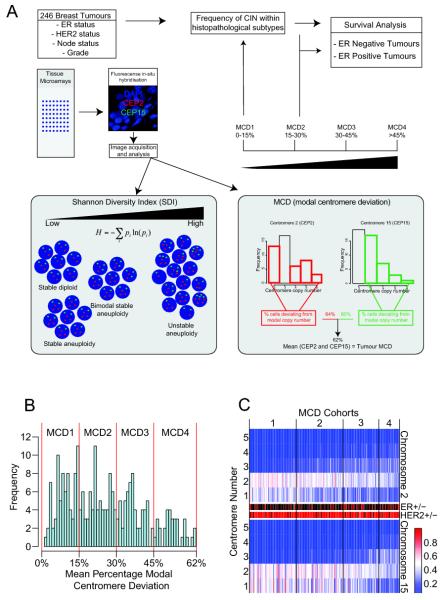
Figure 1. Distribution of average Modal Centromeric Deviation across the Leeds primary breast cancer cohort.
Figure 1A: Flowchart of experimental procedures and breast cancer cohort CIN analysis. Figure 1B: Histogram distribution of the percentage of nuclei with deviation from the modal centromere signals and allocation of MCD cohorts 1-4. The y-axis shows the frequency of the MCD score. The MCD scores were grouped into four cohorts with similar range. Figure 1C: Heatmap of centromeric distribution for chromosome 2 and 15. Each column represents one tumour ranked according to MCD scores, with corresponding ER status: ER-negative (red), ER-positive (black) and HER2 status: HER2 negative (red), HER2 positive (black). The rows of the heatmap indicate the centromere number of each chromosome per nucleus and colours the percentage of nuclei having the particular centromere number (blue = 0%, red = 100%). For diagrammatic purposes the figure only portrays centromere counts between one and five.

