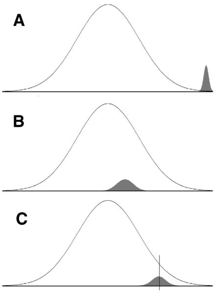
Figure 1.

Schematic representation of three possible distributions of 499,000 random (open curve) and 1,000 real (shaded curve) associations between SNPs and a phenotype. The horizontal axis represents the magnitude of correlations between SNPs and the phenotype; the vertical axis represents frequency. (A) Scenario with large single SNP effects. (B) Scenario with very small effects. (C) Scenario with small effects; the vertical line represents a cutoff separating potentially real from random effects. (Curve graphic courtesy D. Elrod.)
