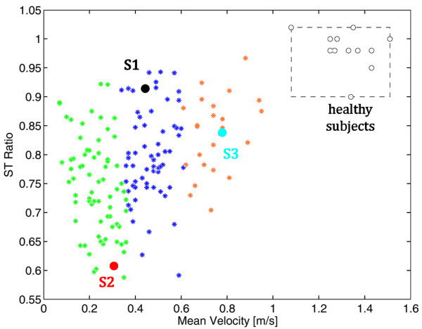
Figure 2.
The patients' distribution in the identified clusters at baseline. The three clusters are reported with asterisks of different colors. S1, S2 and S3 are the black, red and light blue points, respectively. The normality ranges obtained by the group of healthy subjects are represented by the grey area (the boundary are the minimum and maximum values).

