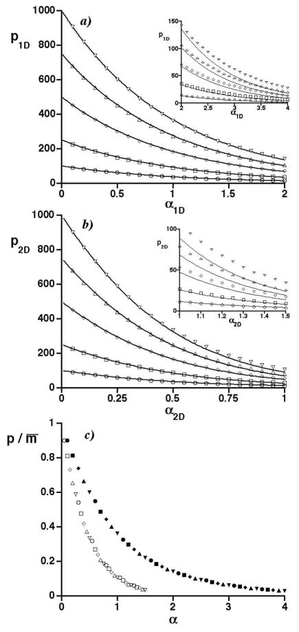
Figure 2.
a) Graph of the average number of observed peaks in 1D separations (p1D) vs. the 1D saturation (α1D) for numbers of randomly distributed constituents m equaling 100 (○), 250 (□), 500 (◇), 750 (△), and 1000 (∇). Curves are SOT predictions. Inset shows results at large α1D. b) As in a) but for 2D separations having an aspect ratio of one. c) Graph of the ratio of the average numbers of observed peaks to mixture constituents (p/m̄) vs. the saturation (α) of 1D and 2D separations. Selected simulation results in a) and b) are represented by filled and open symbols, respectively. Symbol types are the same as in a) and b), e.g., circles for m = 100.

