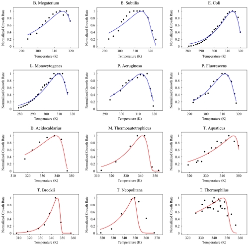
Fig. 4.
Black circles denote growth rate as a function of temperature for species listed. On the Y axis, we plot growth rate normalized with respect to maximum growth rate, whereas on the X axis we plot temperature. Solid lines are fit to data from Eq. 8. Red graphs denote thermophilic species, whereas blue curves are for mesophiles. Sources of the data are given in table 2 in the supplemental material of ref. 7. Reprinted from ref. 7, Copyright 2011, with permission from Elsevier.

