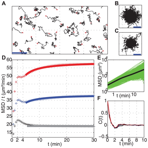
Figure 1. Cell track analysis.
(A) Examples of cell trajectories lasting 50 min obtained at a cell density of  . Red arrows represent starting points. (
 ); (B–C) Typical cell tracks, with their origins brought to a common point, are shown for (B) a condition of fast cell displacement (under a perfusion flow of 30 mL/h), and (C) a condition of slow cell displacement (same cell density without flow). (
 ); (D)
  divided by time lag as a function of time lag for 3 typical cell conditions: red crosses, fast moving cells
  ; blue crosses, intermediate moving cells
  ; black crosses: slow moving cells
  . Solid lines are fits using the Fürth's formula. This plot reveals an overshoot at 2 min. The slower the cells, the larger the overshoot; (E) Mean Square Displacement (
 ) as a function of time lag
  in log-log scale. Green lines: individual
  for each tracked cells, revealing the large dispersion of our population. Black bold line: Average
  of all tracked cells; (F) Velocity autocorrelation C(t) as a function of time lag for the same cell conditions as (D), showing a negative peak at 2 min.

