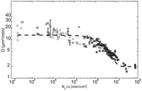
Figure 4. QSF density triggers cell motility: Summary of all experimental results.
Diffusion Coefficient  is plotted as a function of calculated
  (with
(with  , the rate of QSF secretion) for all experimental points: ‘aging’ experiments (square), cell density experiments (triangle), flow experiments (circle). All data are well fitted by the following equation
  ; with
  ,
,  ,
,  ,
,  . This empiric fit allows to easily define two plateaus at low and high density of QSF, respectively. For clarity, we reported only error bars on 3 representative experiments. Error bars represent SEM.

