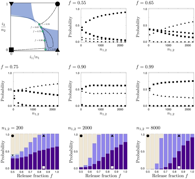
Figure 7. Searching for an optimal release strategy.
The upper left panel illustrates the deterministic basins of attraction for  ,
,  , and
, and  . The blue line illustrates possible starting points for a release of size
  for all possible values of the release fraction,
  , into population 1. Blue disks correspond to points of illustration in the five following panels. The arrow streams represent example trajectories of deterministic dynamics. The following five panels are labeled according to the release fraction
  . Symbols correspond to the probability of reaching the correspondingly labeled corners (in the upper left panel) and indicate how they change with
  . Although complete fixation or loss are the only possible long term events, there is a probability that the neighborhood of, e.g.,
  ,
,  is reached first, which we refer to here by triangles. In particular, note that the probability ranks interchange at certain population size for
  and
and  . The three bottom panels, labeled with the respective system sizes, show the corner probabilities as a function of
  . A release strategy with
  maximizes the likelihood of transforming both populations. In contrast to that,
  , maximizes the likelihood of transforming only a target local population. Higher values of
  then proceed to an increasing likelihood of rapid loss in both populations. All results are obtained from
  independent realizations.

