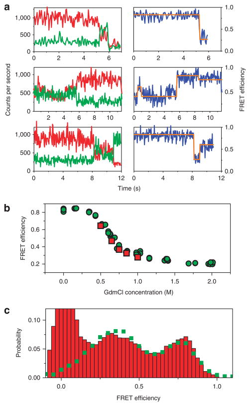
Figure 2. Single-molecule FRET trajectories.
(a) Three examples of fluorescence trajectories of individual AK molecules, each showing one or more transitions between different FRET efficiency levels. In each example, the left panel shows the experimental traces from the donor and acceptor channels, whereas the right panel shows the FRET efficiency trace, calculated till the photobleaching point. The orange lines in the right panels are state assignments based on the HMM analysis, and obtained with the Viterbi algorithm. The transitions between different FRET states seen in the trajectories are anti-correlated, as were > 90% of the transitions seen in our data. See further examples of trajectories in Supplementary Figure S5. (b) Comparison of single-molecule results to the bulk denaturation curve. For the bulk curve, fluorescence spectra of a sample of double-labelled protein molecules were measured at increasing concentrations of GdmCl, and FRET efficiency values were then calculated from them (green points). Single-molecule mean FRET efficiency values (red points) were calculated from the trajectories taken at each GdmCl concentration. These values were obtained by averaging over the initial half a second of each trajectory, so as to avoid the effect of photobleaching. (c) Comparison of the probability distribution of FRET efficiency values obtained from single-molecule trajectories at 0.65 M GdmCl (green squares) to a histogram obtained from a free-diffusion single-molecule experiment performed at the same concentration (red bars). The peak at zero FRET efficiency in the free-diffusion histogram is due to molecules labelled with donor only. Extra FRET efficiency probability distributions appear in Figure 4.

