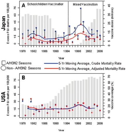
Figure 2. Seasonal excess pneumonia and influenza (P&I) mortality rates among the Japanese (A) and the US elderly (B), aged 65–89 years, 1977–78 to 2005–06 seasons.
Squares represent seasons dominated by influenza A/H3N2 viruses; circles represent seasons dominated by influenza A/H1N1 or B. Blue symbols represent crude excess mortality estimates; red symbols represent excess mortality estimates adjusted for population aging and trends in baseline mortality risk. The blue and red lines represent 5-yr moving averages of the crude and adjusted seasonal excess mortality rates, respectively. Grey bars in (A) represent the number of vaccine doses distributed per influenza season in Japan; grey bars in (B) represent the influenza vaccine coverage among the US non-institutionalized elderly aged ≥65.

