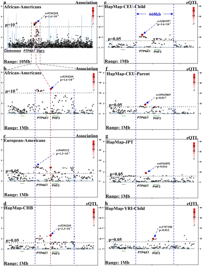
Figure 1. Regional association and eQTL plots around PHF3-PTP4A1 region.
[Left Y-axis corresponds to −log(p) value; right Y-axis corresponds to recombination rates; quantitative color gradient corresponds to r2; red squares represent peak SNPs. (a) regional association plot in AAs for a 10 Mb region surrounding the peak association SNP (rs9294269) in PHF3-PTP4A1; (b, c) regional association plots in AAs or EAs for a 1 Mb region surrounding the peak association SNP (rs9294269) in PHF3-PTP4A1; (d–h) regional eQTL plots in HapMap populations for a 1 MB region surrounding rs9294269; (i) LD map for all available markers for a region surrounding rs9294269 in EAs (Illumina Human1M beadchip), in which red bars represent the peak SNPs in each population].

