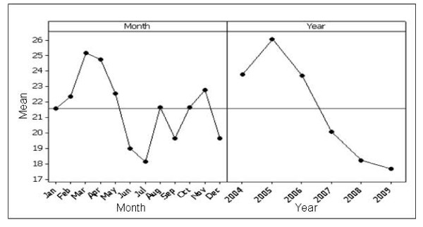
Figure 4.
Main effects plot for lung cancer. The plot on the left demonstrates search activity for each month; each point is the average of all values across all years, e.g. point 1 is the average search activity for January across all years. The plot on the right shows the effect of year; each point is the average search activity for a particular year.

