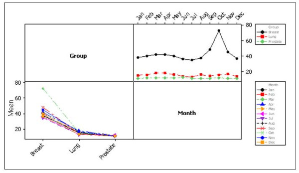
Figure 5.
Interaction plot for cancers by year. The plot on the left demonstrates search activity for each of the three cancers; each point is the average search activity for a particular year. The plot on the right shows search activity by month; each point represents an average of all values for a particular month across all years.

