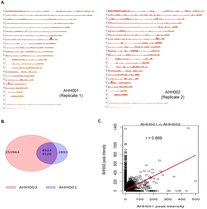
Figure 2. Comparison of Apoptoseq Replicates.
A. Genome-wide graphs of AHH001 and AHH002. B. Venn diagram of overlaps between AHH001 and AHH002. The number in the pink circle indicates AHH002 peaks that did not overlap with AHH001 peaks. The number in the blue circle indicates unique AHH001 peaks that did not overlap with AHH002 peaks. The top number in the purple or overlapping region indicates AHH002 peaks that overlap with AHH001 peaks and the bottom number indicates AHH001 peaks that overlapped with AHH002 peaks. C. Graph comparing the peak intensities of overlapping regions in AHH001 and AHH002.

