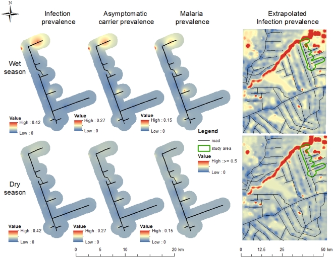
Figure 7. Spatial distribution of infection, asymptomatic carrier, and malaria prevalences.
From left to right, maps depict interpolated surfaces of predicted infection prevalence (i.e.,  ), asymptomatic carrier prevalence (i.e.,
  )), and malaria prevalence (i.e.,
  ), all for the studied area, and an extrapolated surface of infection prevalence. Upper and lower maps are the prevalence surfaces for the rainy and dry seasons, respectively. Interpolation was done using an inverse distance weighted algorithm.

