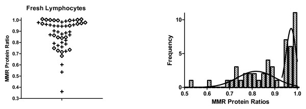
Figure 3.
DNA mismatch repair protein ratios for fresh lymphocyte samples from a population of individuals that were at high risk for having a germline MMR mutation. The left panel shows a scatter plot of MMR ratios. The "+" signs represent ratios where MLH1 was less than MLH2. The diamonds represent ratios where MSH2 was less than MLH1. Because these plots were largely superimposable, we pooled them to establish the histogram shown in the right panel. The histogram shows that there is a bimodal distribution of MMR ratios. Moreover, the proportion of cases in the smaller mode (left most curve in right panel) is ~28%, which is very close to the proportion of patients (25%) at our recruitment site that have historically proved to have a germline MMR mutation.

