
Figure 2. Spatial distribution of orientation preferences in monkey V1.
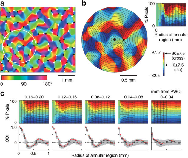
(a) Orientation preference map obtained by optical imaging. Color scale at the bottom left shows preferred orientations in degrees. White and black dots indicate clockwise and counterclockwise pinwheel centers (PWCs), respectively. The white circle represents an example of a region of interest (ROI), and the plus sign indicates the center of the ROI. (b) Magnified view of ROI, consisting of 20 concentric annular regions whose radii vary at 0.5 mm intervals (black circles). Color scale at bottom right shows the range of preferred orientation relative to the preferred orientation at the ROI center (plus sign). The top right panel shows the orientation population within the ROI as a function of annular region radius. (c) Variation of orientation populations in ROIs across the PWC. The imaged area (4.5 × 3.9 mm2) was scanned by shifting a circular ROI, and the data were pooled into five groups according to the distance between the ROI center and the nearest PWC: 0–0.04 to 0.16–0.20 mm from the PWC. Top row, orientation populations obtained from the median of pooled data in each group plotted as a function of annular region radius. Bottom row, the orientation distribution indices (ODIs) plotted as a function of annular region radius. Solid lines and gray areas indicate the median ODI and the range from 25th to 75th percentiles of ODIs, respectively. The ODIs in many regions differ significantly from zero (red asterisks, P < 0.0025). Data for all monkeys are in Supplementary Fig. S1.