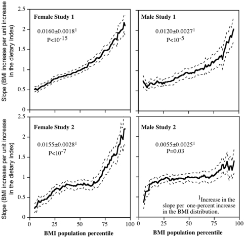
Figure 3. Percentile plot showing the slope for BMI vs. the dietary index (high-meat/low-fruit content, Y-axis) at each percentile of the BMI distribution (X-axis).
The exact definitions of the dietary indices are described in the Methods Section. The dashed lines designate one standard error. Data adjusted for age, race, and education. Study 1 included additional adjustment for parental adiposity.

