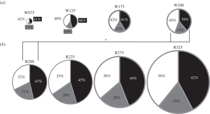
Figure 4.
Pie charts showing the percentage of total average positive power contributed at the hip (white), knee (grey) and ankle (black) joints. The lines marked with an asterisk indicate between which conditions the ankle and hip contributions were significantly different (p < 0.05). The total area of each pie represents the total average positive power relative to the other conditions. (a) Walking; (b) running.

