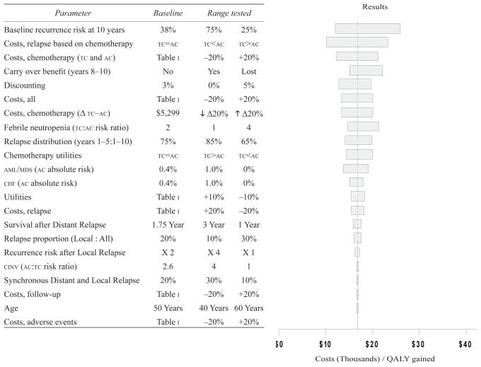
FIGURE 2.
Sensitivity analysis. The y axis shows the parameters and the ranges tested in the sensitivity analysis; the x axis reflects the resulting cost–utility value in thousands of Canadian dollars per quality-adjusted life year (qaly) gained. The dashed vertical line represents the mean cost–utility result (CA$16,753/qaly gained), and each bar shows the range of the cost–utility estimate for each parameter tested. For each parameter tested, the lower and higher cost–utility values in the bar respectively reflect the cost–utility estimates for the first and second columns of the range rested. The order of variables from top to bottom, with corresponding longer-to-shorter bars in the tornado plot, reflects the variables with more-to-less impact on the cost–utility results. tc = docetaxel–cyclophosphamide; ac = doxorubicin–cyclophosphamide; aml/mds = acute myeloid leukemia or myelodysplastic syndrome; chf = congestive heart failure; cinv = chemotherapy-induced nausea and vomiting. Parameter Baseline Range tested

