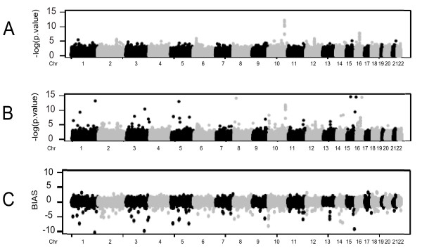
Figure 2.
Summary plots. In Panel A: a graphical representation of the distribution of empiric association statistics throughout the human genome. In Panel B: same as A using the association statistics derived from imputed frequencies. In panel C: The distribution of the observed bias of association statistics of empiric and imputed frequencies.

