Figure 3.

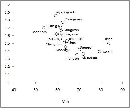
Average ill-health scores plotted against average regional income for 16 regions. The x-axis: Per capita income. The y-axis: Ill-health scores.

Average ill-health scores plotted against average regional income for 16 regions. The x-axis: Per capita income. The y-axis: Ill-health scores.