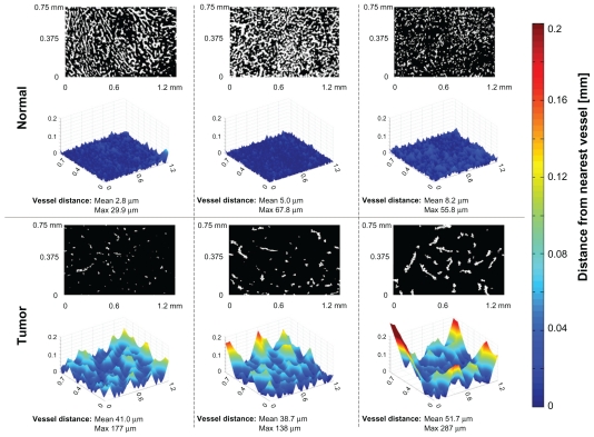
Figure 7.
Computation of the distance of normal liver cells (panels across top) or tumor cells (bottom) to their nearest blood vessel. The black and white images indicate tissue (black) and vessel (white) locations. Each normal and tumor region was selected for analysis based on the fewest number of vessels observed at low magnification. The three-dimensional relief graphs show the distance in microns to the nearest blood vessel for a given tissue location. As the graphs increase in height, that tissue location is further from its nearest blood vessel. In all examples, the tumor cases have cells located further away from nearest blood vessels (indicated by larger mean and maximum values).

